AHHA Brand Launch
Brand & Product Naming
Copywriting
Art Direction
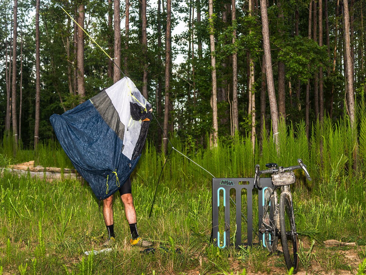
A new, nameless brand came to us with a simple, intuitive product– a foldable metal bike rack. Concerned their brand could quickly be forgotten due to a straight-forward product offering, they were seeking something bold and expressive to match the excitement they found as bike riders. The task was to give their clever idea a name, a comprehensive brand identity, and an exciting, dynamic website to launch into the world with— ahha.bike.
AHHA as a name was born from the intuitive nature of the product; and as an added bonus, the palindrome applied beautifully to a product that functioned from multiple angles. The company founder, an architect, wanted all future products to be intuitive and solution-oriented, making AHHA the clear choice as the brand name. Nothing beats the satisfaction of figuring it out!
The playful product name, Toaster, came from a simple observation of the slotted product design. It would set a precedent for the brand’s tone of voice– at its core simple and matter-of-fact, but cheeky. I utilized the original product brief, interviews with the founder, and comprehensive cycling market knowledge to craft the key messages that would populate the website, and early AHHA communications.
The result was a brand identity with a refreshing look in the often repetitive cycling space— instantly differentiated for its exciting tone, colors, and point of view.